
Got the code? Welcome, builder!
You're heading into Invent the Future — instructors hand out the access code on day one.
You're heading into Invent the Future — instructors hand out the access code on day one.
Every single element on a webpage, from your <h1> to your <img>, is treated by the browser as its own rectangular box. The whole page is boxes inside boxes inside boxes. Once this clicks, CSS stops feeling magical and starts feeling mechanical, and mechanical is a thing you can debug.
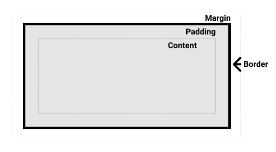
A box has four layers, from the inside out:
| Component | What it is | Gift-box analogy |
|---|---|---|
| Content | The text or image itself. | The toy inside the box. |
| Padding | Space inside the border. | The bubble wrap around the toy. (Pushes content away from the edge of its own background.) |
| Border | The line around the element. | The cardboard box itself. |
| Margin | Space outside the border. | The space between your box and the next box on the shelf. |
.card {
  padding: 1.5rem;             /* inside spacing  */
  border: 1px solid #e5e5e5;   /* visible edge    */
  border-radius: 8px;          /* rounded corners */
  margin-bottom: 1rem;         /* outside spacing */
}
The rule of thumb worth memorising: use padding to push content away from the edge of its own box. Use margin to push other boxes away.
Add padding to an element with a background colour and you can see exactly what padding does. It adds space inside the box's edge:
h1 {
  background-color: lightblue;
  padding: 20px;  /* 20px of space on all 4 sides, inside the background */
}
Without padding, the text sits flush against the edge of the light-blue background. With padding, there's breathing room.
box-sizing: border-boxHere's a surprise that has annoyed web developers for decades: by default, width: 200px means the content is 200px, and padding and border get added on top, so the box ends up wider than you asked for. Most stylesheets fix this with one rule at the very top:
* {
  box-sizing: border-box;
  margin: 0;
  padding: 0;
}
border-box makes width mean the whole box, content, padding, and border included. The margin: 0; padding: 0; part wipes the browser's default spacing so every pixel of space on the page is one you chose.
If your page suddenly collapses into a wall of text after adding this, wonderful. That's the blank canvas. Now add your own spacing back deliberately.
A block element stretches to fill the full width of the browser by default, so there's nothing to centre. Give it a width limit first, then split the leftover space:
.container {
  max-width: 960px;   /* never wider than this */
  margin: 0 auto;     /* 0 top/bottom, automatic (equal) left/right */
}
margin: 0 auto only works when the element has a max-width (or width) smaller than the window. Without a constraint there's no leftover space to divide. This two-line pattern is how almost every website keeps its content in a comfortable readable column. Two lines! It does a lot of work for two lines.
Browsers have a built-in tool that shows you the box model for any element on any page.
When your layout doesn't look right, this is the first tool you open. "I don't know why it's doing that" is a temporary state. The answer is sitting right there if you inspect.